How to Check the Font Weight of a WOFF File
Websites often load the same font in several weights. You might end up with four WOFF files that look alike and have no clear names. Which one is Regular? Which one is Bold? This guide shows you how to check the font weight of any WOFF or WOFF2 file, from a quick look to the exact number.
What font weight means
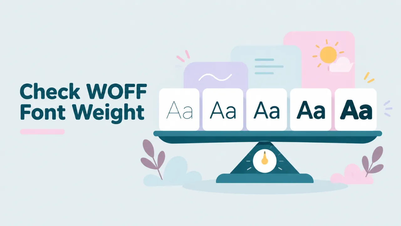
Font weight is how thick the strokes of the letters are. A thin font has light, delicate lines. A bold font has heavy, dark lines. Most font families come in several weights so designers can mix them. For example, a heading in Bold and body text in Regular.
Fonts describe their weight in two ways:
- A style name, like Light, Regular, Medium or Bold. People read this.
- A weight number from 100 to 900. Browsers and apps use this.
Both are stored inside the font file. A WOFF file keeps them, just packed for the web.
The weight number scale
The weight numbers follow a common scale. CSS uses the same scale, so it helps web developers too.
| Number | Common name |
|---|---|
| 100 | Thin (Hairline) |
| 200 | Extra Light |
| 300 | Light |
| 400 | Regular (Normal) |
| 500 | Medium |
| 600 | Semi Bold |
| 700 | Bold |
| 800 | Extra Bold |
| 900 | Black (Heavy) |
Not every family uses every step. A small family might only have 400 and 700. A big one like Inter or Poppins has all nine, plus italics.
The quick way: read the style name
For most people, the style name is enough. Here is how to see it.
- Open the free WOFF viewer.
- Drop your WOFF or WOFF2 file onto the pink box.
- Scroll down to “Font information”.
- Look at the Style box and the Full name box.
You will see something like “Style: SemiBold” and “Full name: Poppins SemiBold”. That tells you the weight in plain words. Match it to the table above and you have the number, too. SemiBold is 600.
The preview helps as well. Type a word in the preview box and compare it with another file from the same family. The heavier one is the higher weight.
Try it: Drop your WOFF file in to see its style name and preview it.
Checking several files at once
If a website gave you many files, open them one at a time. Write down the name of each file and the style you see. You will end up with a small list like this:
| File | Style shown | Weight |
|---|---|---|
| f1.woff2 | Regular | 400 |
| f2.woff2 | Italic | 400 italic |
| f3.woff2 | SemiBold | 600 |
| f4.woff2 | Bold | 700 |
Now you know exactly which file is which. That makes it easy to rename them or to write the right CSS.
The exact way: read the weight number
The style name is written by the designer. Most of the time it matches the weight number. Sometimes it does not. A designer might call a weight “Book” or “Heavy”, which do not fit the table neatly. If you need the exact number, read it from the font.
The number lives in a part of the font called the OS/2 table. The field is called usWeightClass. Here are two free ways to read it.
With fontTools
fontTools is a free Python library that font makers use. Install it with pip, then dump just the OS/2 table:
pip install fonttools brotli
ttx -t OS/2 myfont.woff2
This makes a file called myfont.ttx. Open it in a text editor and look for this line:
<usWeightClass value="600"/>That is the exact weight. The brotli part is only needed for WOFF2 files.
With FontForge
FontForge is a free font editor. Open your WOFF file in it. Then go to Element, Font Info, and click OS/2. The Weight Class field shows the number. FontForge also shows the style name under PS Names. For more on this app, see how to edit a WOFF file.
Variable fonts: one file, many weights
Some fonts are variable fonts. A single file holds a whole range of weights. Instead of four files, you get one file that can be any weight from, say, 100 to 900.
You can often spot a variable font by its name. It may include words like “Variable” or “VF”, or show a range like “wght”. When you open it in a viewer, you see the default weight, which is often Regular. The other weights are there, but you set them with CSS or in a design app.
To check the weight range of a variable font, use fontTools and look at the fvar table:
ttx -t fvar myfont.woff2The output lists each axis. For weight, the axis tag is “wght”, with a minimum, default and maximum value.
Good to know: Google Fonts often serves variable fonts in WOFF2. If you saved one file and it seems to cover every weight, that is why.
Why the weight looks wrong on your website
Sometimes you pick Bold in CSS, but the text looks fake or blurry. Here is what happens.
If the browser cannot find a real Bold file, it creates a fake bold. It just thickens the Regular letters. This is called faux bold. It looks muddy and uneven. The same thing happens with italics.
To fix it, make sure each weight you use in CSS has its own file and its own @font-face rule. Then check each file’s weight with the viewer, so you do not link the wrong file to the wrong number.
Why the weight looks wrong in Word or Photoshop
On your computer, the problem is often grouping. Apps group fonts by family name. If a family uses two different name fields, the app may show strange entries like “Poppins SemiBold” as its own family. That is normal. Our guide on finding the font name inside a WOFF2 file explains the different name fields.
Remember that you cannot install WOFF files on your computer. Convert them to TTF first. See how to convert WOFF to TTF and how to install a WOFF font on Windows.
How weight affects file size
Heavier weights are not always bigger files. File size depends more on how many characters the font has than on its weight. A Bold file with only Latin letters can be much smaller than a Regular file that covers Greek and Cyrillic too. If you are building a website, only load the weights you actually use. Each extra weight is another file your visitors must download.
Rename your files once you know the weight
After you check each file, give it a clear name. A good pattern is family, weight number, then style. For example:
- poppins-400.woff2
- poppins-400-italic.woff2
- poppins-600.woff2
- poppins-700.woff2
Names like these save time later. You can see at a glance which file you need, and your CSS becomes easier to read. Renaming the file does not change anything inside the font. The browser only cares about the font data, not the file name.
Picking the right weight for your text
Knowing the weight is one thing. Choosing it is another. A few simple rules help:
- Body text reads best at 400. Very light weights like 200 or 300 can be hard to read on small screens.
- Headings usually look good at 600 or 700. They stand out without shouting.
- Buttons and labels often use 500 or 600, so they feel clickable.
- Very heavy weights like 800 and 900 work for short, big headlines only.
Always test on a phone. A weight that looks fine on a big monitor can look too thin on a small, bright screen. The size slider in the viewer helps you check this before you commit.
A quick checklist
When you want to know a WOFF file’s weight, follow this order:
- Open the file in the viewer and read the Style name.
- Compare the preview with other files from the same family.
- If you need the exact number, read usWeightClass with fontTools or FontForge.
- If one file seems to cover every weight, check whether it is a variable font.
Common questions
Is Regular always 400?
Almost always. A few older fonts use other values, but 400 is the standard for Regular.
What is the difference between Medium and SemiBold?
Medium is 500 and SemiBold is 600. Medium is a small step up from Regular. SemiBold is close to Bold but lighter.
Does WOFF2 store weight the same way as WOFF?
Yes. Both formats keep the same font data inside. Only the packing is different. You can read more in WOFF vs WOFF2.
Can I change the weight of a font?
You cannot make a real new weight by changing a number. The number only labels the weight. The actual stroke thickness is drawn by the designer. Changing the label without changing the shapes will only confuse apps.
Summary
To check the weight of a WOFF file, open it in a WOFF viewer and read the Style name. For the exact number, read the usWeightClass field with fontTools or FontForge. If one file covers many weights, it is a variable font. Knowing the right weight helps you pick the right file, write the right CSS and avoid fake bold text.